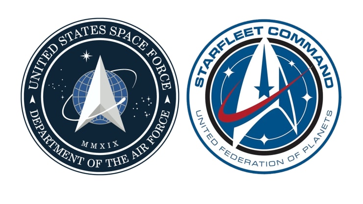
Over the years, Star Trek has been responsible for inspiring
real world innovations from tablet computers to needleless injection devices and real time translators.
Now, the science fiction franchise appears to have influenced Space Force, the US military's newest branch, in its choice of logo: a symbol resembling an arrowhead ringed by an orbiting object and set against a starry backdrop.
 (The White House/CBS)
In the Star Trek universe, this is the insignia of Starfleet -- the peacekeeping and exploration force of the United Federation of Planets. The multiplanetary alliance is headquartered on Earth, and its adversaries include alien species like Klingons and Romulans.
It has appeared as a pin on the uniforms of iconic Star Trek characters such as Captain Kirk and Spock ever since the original series debuted in 1966, and continues to feature in the franchise's current shows and movies.
The Space Force logo was unveiled by President Donald Trump Friday, who wrote in a tweet: "After consultation with our Great Military Leaders, designers, and others, I am pleased to present the new logo for the United States Space Force, the Sixth Branch of our Magnificent Military!"
It drew immediate mockery among social media users.
"Should've been consulting with Gene Roddenberry's lawyers," wrote the popular "Pourmecoffee" account, referring to the late screenwriter and producer of Star Trek's original series and its first spin-off, "The Next Generation."
But if it is a case of imitation, then the plagiarism may not be new: the logo is strikingly similar to that of the Air Force Space Command that was founded in 1982 and succeeded by Space Force in December 2019.
Sciencealert.com
No comments:
Post a Comment